Modern Electrics Revival | 2nd Font Release
- Giuseppe Cavaleri
- Jul 21, 2025
- 1 min read

Updated: May 6

Available here at Creative Market, Behance, and Etsy.
MODERN ELECTRICS, the second resurrected typeface by GiGi Designs, is a monument to the dazzling early electric age. An era of inquirers delighted in sharing homespun experiments to a diaspora of like-minded enthusiasts. It’s at home doodled in the margins of the first electrical magazine for everyone- whose name it shares, & the source of its original 11 letterforms.
It wears a Marconi Has A Posse tee and yearns to be scribbled in ballpoint blue. It was etched into the desk of Hugo Gernsback, who took the limited fanciful stories features from later issues and launched the first sci-fi pulp magazine in 1926: Amazing Stories. It hands you a blindfold? You spin around 3x and put a finger down on a map. Kit up. Adventuring begins at dawn.
MODERN ELECTRICS includes 1 font style in .OTF format and comes QWERTY keyboard ready.
26 upper case
26 lower case
29 special characters
Supports 5 currencies: Dollar, Pound, Euro, Yen, & Yuan


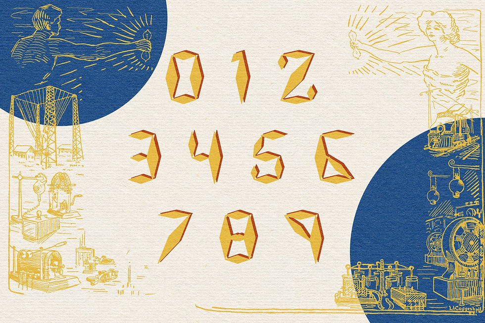

It was a joy to piece this together from the masthead. I skimmed through the MODERN ELECTRICS archive and out of all the pages only the covers from 1908 to partway through 1910 use this font.

Clearly hand doodled, every dart in every letter was a little off. Standardizing the forms and expanding beyond the original 11 letters was a fun puzzle.


Comments