

Solid branding flows from strategy
VIP Study Recruitment Collateral

The Phase I/ II Vaccination Is Prevention (VIP) study reached early recruitment for Phase I in record time and
exceeded its Phase II recruitment goal aided by my complete design package. VIP Study successfully recruited highly disenfranchised populations primarily through street-based community strategies. Specifically San Francisco’s streets and community clinics — environments saturated with information. Community boards, light poles, and other spaces filled with concert posters, health services, show fliers, yoga studios, writing workshops, prayer groups, piano lessons, and countless other notices in a vibrant urban environment competing for attention.
If recruitment materials were going to succeed in that environment, they couldn’t simply look “good.”
They needed to stand out, communicate instantly, and feel at home in the world they entered.
FIGURE 1 — Loud Audience Targeted Study Collateral

FIGURE 2 — Logo

Strategy First Visuals
The VIP study required a simple, adaptable visual identity that could phase seamlessly across posters, outreach materials, patient tools, and clinic documentation.
The VIP logomark was approached with a scalability-first mindset — from small stickers and documents to larger recruitment posters and clinic signage. It needed instant recognizability at all sizes.
Depending on how it’s viewed, the mark reads in different ways:
-
Winking face (V eye, I nose, and
P nose & eye)
-
The circular shapes imply hoodie
-
Letters arrangement creates a subtle sense of movement and personality
This ambiguity invites the viewer to engage with the mark while keeping the design clean and memorable.

FIGURE 3 — Recruitment Posters

FIGURE 4 — Engaging Patient Materials

FIGURE 5 — Branded After-Visit Kits

FIGURE 6 — Branded First Aid Kit

One-sheets! Rip tabs! Handbills!
Recruitment materials were developed for use across clinics, hospitals, community partnerships, and street-level outreach. Posters were designed to intentionally break the visual patterns common in crowded urban environments.
The bold black background and minimal white text rendered in intentionally clashing type creates immediacy via sharp visuals.
In kinetic environments full of people on the hustle, simple shapes and strong contrast help a message stand out.
Most people aren’t reading every flier. And we needed to reach people who wouldn’t normally stop to look.
These materials were engineered to cut through the din.
Built For Real Environments
For people navigating unstable housing or busy street environments, opportunities to connect with research teams are often asynchronous. The tabs created a small physical pocket reminder- transforming a moment of curiosity into a possible future contact.
Each tab included the study recruitment phone number, office address, and a clear invitation to stop by. Many people encountering these posters would not have phones on hand, or might hesitate to initiate a call immediately, or be between phones. The tabs environmental persistence was an asset.
Every tab removed was excellent an ambient signal boost.
Patient-Facing Tools
Participation in the study included a small after-visit kit designed to support patient well-being, and tools for ongoing monitoring and reporting.
Each kit contained practical items such as:
-
a basic medical supply kit
-
Patient Reminder Card w/ patient ID and follow-up appointment
-
small branded objects like keychains, pen (choice of red or blue), and fun stickers
-
Week supply of disposable thermometers
These tools helped patients track symptoms, remember appointments, and maintain communication with the study team.
The VIP Study Med Kit
Includes basic critical supplies in a convenient fashionable package.
-
BZK & alcohol pads
-
Adhesive strips
-
Acetaminophen tablets (325mg)
-
Antacid tablets (not pictured)
-
Bilingual first-aid guide covering common issues such as cuts, burns, insect bites, and shock.
The kit provided practical tools for day-to-day care while reinforcing the study’s commitment to participant wellbeing.
FIGURE 7 — Patients Participate Successfully When Set Up for Success
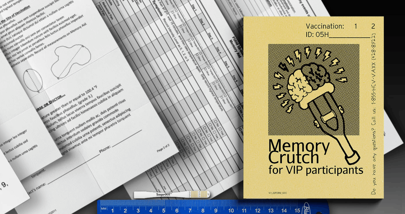
The VIP Memory Crutch
The VIP Memory Crutch journal was adapted to meet the needs of participants navigating busy and often unstable daily environments.
The pocket-sized format integrated:
-
symptom tracking
-
diagnostic self-reporting tools
-
appointment reminders
-
transit information for getting to clinic visits
Instructions were intentionally written to feel human and practical, not clinical.
It’s a journal patients actually kept.
FIGURE 8 — Team-Vetted Patient-Approved

Self-Referral
Patient Binder
A thick 5" binder of resources vetted by staff and patient to secure our folks continued receiving referrals that met their needs, and were treated right by social service staff. It was a living document actively managed with feedback actively sought.
Every entry added with multiple copies of a page ready for folks with little carrying capacity to tear out and fold up in to their pockets.

FIGURE 9 — Synergy

Strategic Considerations
The VIP study operated alongside the UFO Study, sharing staff, study sites, and a connected participant community.
While each study had its own identity, separate operation systems, and funding sources, the materials were designed to feel part of the same broader ecosystem of outreach and care.
FIGURE 10 — Meeting Patients Where They Are, Creatively


Context Aware Creative
Design for public health research rarely begins with aesthetics.
It begins with understanding where materials will live, who they must reach, and how people move through the environments where those materials appear.
Good branding doesn’t start with style.
It starts with purpose.
Strategy follows.

PUBLICATIONS
-
Randomized Trial of a Vaccine Regimen to Prevent Chronic HCV Infection. N Engl J Med. 2021 02 11; 384(6):541-549. Page K, Melia MT, Veenhuis RT, Winter M, Rousseau KE, Massaccesi G, Osburn WO, Forman M, Thomas E, Thornton K, Wagner K, Vassilev V, Lin L, Lum PJ, Giudice LC, Stein E, Asher A, Chang S, Gorman R, Ghany MG, Liang TJ, Wierzbicki MR, Scarselli E, Nicosia A, Folgori A, Capone S, Cox AL. PMID: 33567193; PMCID: PMC8367093.
View in: PubMed View in: New England Journal of Medicine
-
VIP Study: April 17th, 2018 CDC Grand Rounds, Working Together to Eliminate the Threat of Hepatitis B & C, Presented On YouTube and archived Slide Deck (Slide 51 of 72)
-
"Memory Crutch" illustration by Jason Storm. All other formatting, illustrations, diagrams, and adaptation executed by GiGi Cavaleri

PORTFOLIO: FEATURED GLOBAL HEALTH PROJECTS


PORTFOLIO: FEATURED TYPOGRAPHY

