
TYPOGRAPHY
Welcome to my ongoing practice in archeological typography- where incomplete typefaces, lost alphabets, and retro-futurist fragments are resurrected and reimagined for contemporary designers. One begins with a single surviving glyph from 1898. Another with eleven letterforms from a magazine. And one… corn starch, a camera, and a willingness to get messy.
Select a banner to explore a specific font, or start scrolling.
-
Phosfor (orig. 1898) - Reconstructed from a single surviving letterform.
-
Elevated into a modern type system with 3 working styles and 21 more releasing soon.
-
-
Modern Electrics (orig. 1908) - Revived from 11 surviving letterforms from a periodical with the same name
-
Expanded for designers looking to resurrect the past while inventing the future
-
-
SOON!
-
More typographic archeology in progress- restorations, reinterpretations, and speculative revivals SOON.
-
-
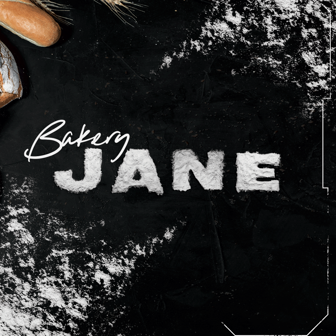
Bakery Jane (2025) - Bakery Jane excavates something different: the physical world itself.
-
Hand molded from corn starch, photographed at ultra-high resolution, and transformed into bitmap OpenType-SVG display glyphs.
-
Bakery Jane is a material study. A modern artifact made by hand in the age of AI.
-


MODERN ELECTRICS
FONT REVIVIAL
MODERN ELECTRICS is a monument to the dazzling early electric age. An era of inquirers delighted in sharing homespun experiments to a diaspora of like-minded enthusiasts. It’s at home doodled in the margins of the first electrical magazine for everyone- whose name it shares, & the source of its original 11 letterforms.
It wears an Marconi Has A Posse tee and yearns to be scribbled in ballpoint blue. It was soldered into the desk which launched Amazing Stories. It hands you a blindfold? You spin around 3x and put a finger down on a map. Kit up. Adventuring begins at dawn.
MODERN ELECTRICS includes 1 font style in .OTF format:
-
Supports 5 currencies: Dollar, Pound, Euro, Yen, & Yuan
-
26 upper case
-
26 lower case
-
All QWERTY special characters


Ships worldwide. Available at these fine retailers:


Phosfor + Aether Type Family
19th century digital letterforms lovingly reconstructed for 21st century creators.
Phosfor is a rationalized type superfamily inspired by a single letter in an early segmented display patent dated 1898. No complete example of this devices' letterforms exist. Neither in original filing, nor from the inventor elsewhere.
With only 10 pages about this device crossing the digital divide, and no other recreation attempts to work from, adapting it for modern use was an interesting riddle to solve. Especially for hashtags and @ symbols. Look forward to seeing how you make it work for you! Phosfor is a fun little personal project to release as my NDA projects soak up more time causing fewer updates here. Excited to share those when I can! Until then--
Enjoy techno-necromancy as its most elegant: Phosfor; 19th century curio refusing relegation to the dustbin of history.
Fun facts:
-
Typically Frank W. Wood's patent filed in 1908 is cited as the first of its kind for now common segmented display devices. Source.
-
George Lafeyette Mason's patent filed 1898, Phosfor's basis, now makes it the earliest known example. Source.
To view various styles in the interactive options use the Select Style dropdown menu in the showcase below.
Or purchase complete sets and individual styles at Behance & Creative Market.
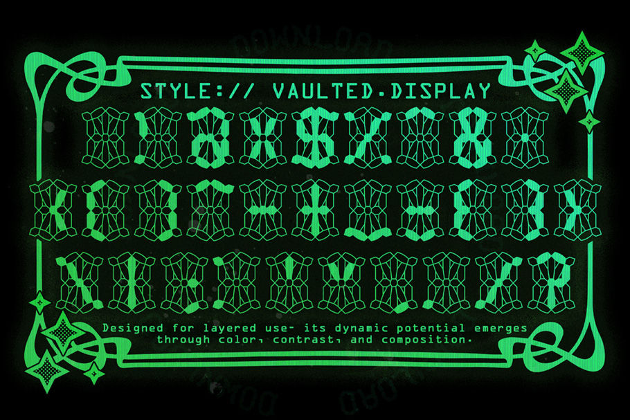
Phosfor + Phosfor Aether Superfamily includes 24 styles and growing!
-
Supports 5 currencies: Dollar, Pound, Euro, Yen, & Yuan
-
26 upper case + variants
-
26 lower case + variants
-
All QWERTY special characters + alternatives
-
35 alternative glyphs
Font styles and taxonomy overview:
Phosfor Vaulted - Slab monospaced typeface
Phosfor Radiant - Slab monospaced typeface
-
Radiant Mk 1 (Currently available)
-
Radiant Mk 2 (Drafted)
Phosfor Aether Subfamily - Mono cased typeface
-
Aether X2 Tilt
-
Aether X3 Italic
-
Aether 4X Lite
-
Aether 5X Pixel (aka: Roman. Matches Radiant and Vaulted weights)
-
Aether 6X Medium
-
Aether 7X Bold
-
Aether 77X Extra Bold
-
Aether 8X Black (TBD)
-
Aether 9X Extended
Phosfor OCR/ Terminal Subfamily (TBD)

Bakery Jane is a hyper textured, ultra-high-resolution OpenType-SVG display font, hand-crafted from real corn starch, molded letter by letter, photographed at 300 DPI, and refined in Photoshop.
AI is a challenge to dig deeper into the depths of human brilliance and creativity. Towards that end, here is BAKERY JANE!
Perfect for bakers, designers, public health storytellers, educators, indie filmmakers, punk rockers-- anyone who wants real tactile grit of real-world materials in their typography. This is matter, texture, accident, shadow, and imperfection; all elevated into usable moveable type!
Suddenly a messy one-off art experiment becomes infinitely scalable. All it takes is:
-
A DSLR
-
Corn starch
-
And way too many hours ~already completed~ in Photoshop
Have the perfect project for this font? It's available for hire! Contact me here.
Due to browser compatibility for OpenType-SVG's no interactable demo is available. Enjoy the video below!


